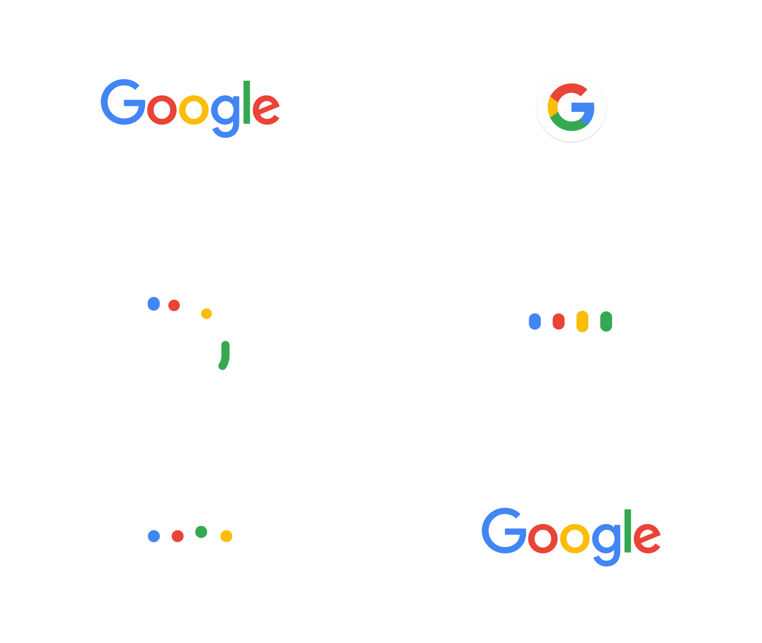
After 17 years of subtle design changes, Google has today revealed the next step in its evolution, it has completely revised its logo.
Gone is the Serif based logo of old, replaced by a new San Serif style Google replaced by the more modern identity which seamlessly transitions across multiple platforms.
Expect to see the Google pages across all platforms from mobile phone, TV, watch, desktop and even Car!
Personally, I like the typeface and it brings this part of Google branding in line with it’s ‘Flat’ design elsewhere
Google’s official blog post can be found here
Discover more from Matt Porter, The Gadget Man - AI, Technology News and Reviews
Subscribe to get the latest posts sent to your email.


